‘kansha’ AR experience
18 x 24” poster, AR design and animation
Honorable Mention - 2025 Graphis New Talent Awards
Objective
Create an engaging educational and visual experience that is a sophisticated language learning tool, as well as beautiful home decor! This layered experience will include a compelling print design and interactive AR capabilities.
This design is inspired by my own experience studying Japanese. Once I had to start memorizing hundreds of kanji, I felt my progress stall and my motivation dwindle. I wanted to create something that would keep a Japanese language learner interested in the process!
This project was completed as an assignment for my MFA in Visual Communication Design at Purdue University.
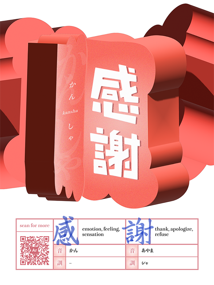
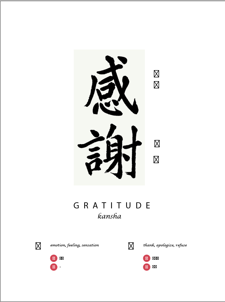
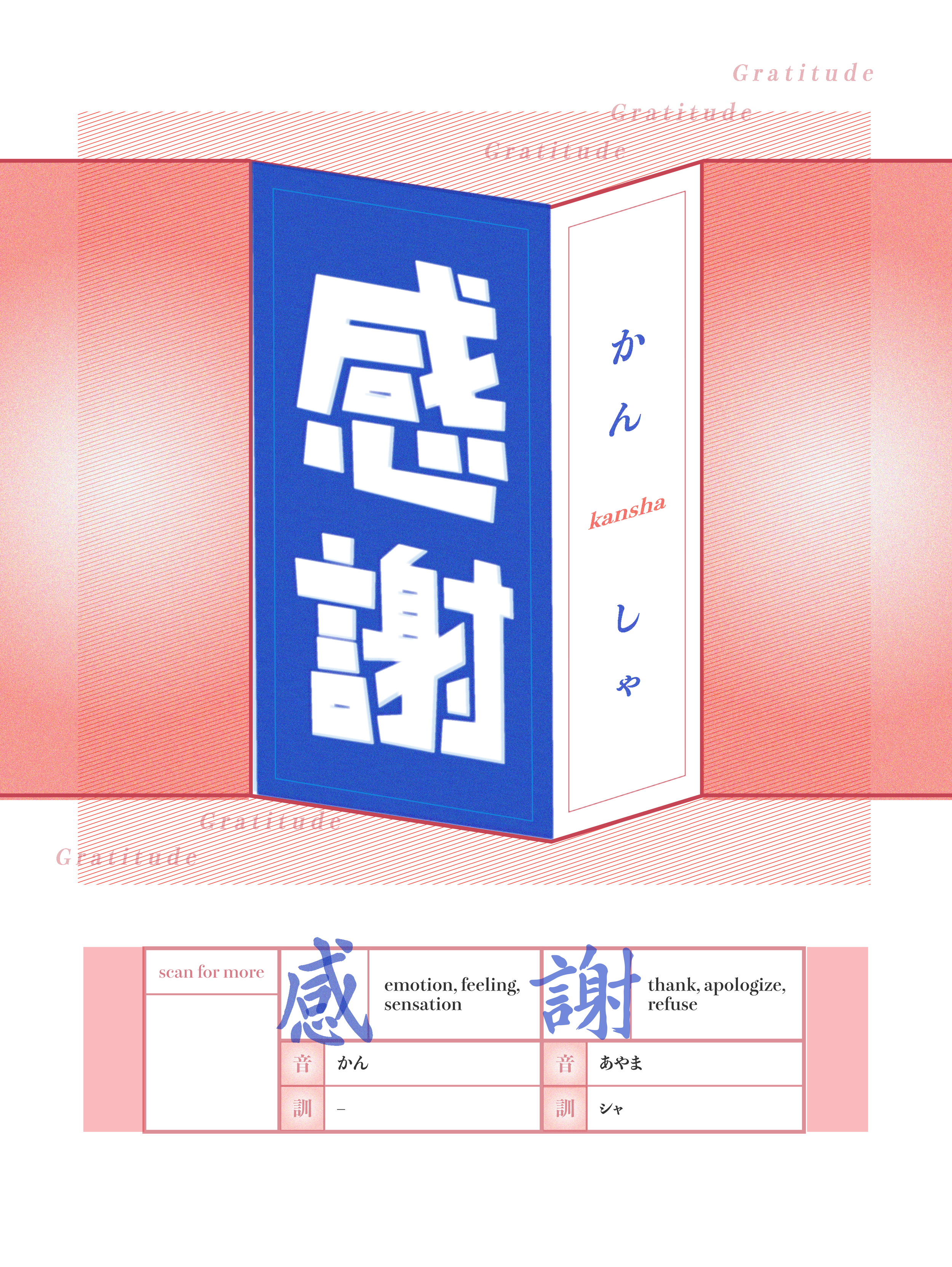
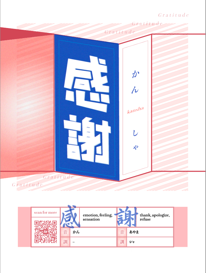
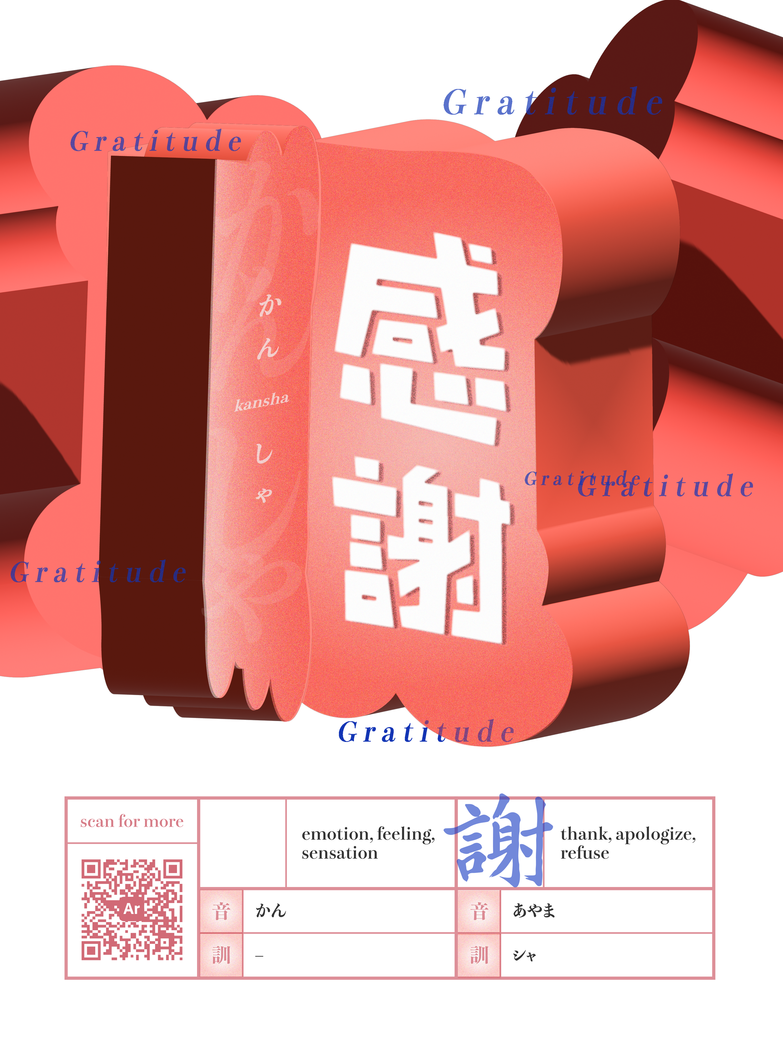
Final poster design
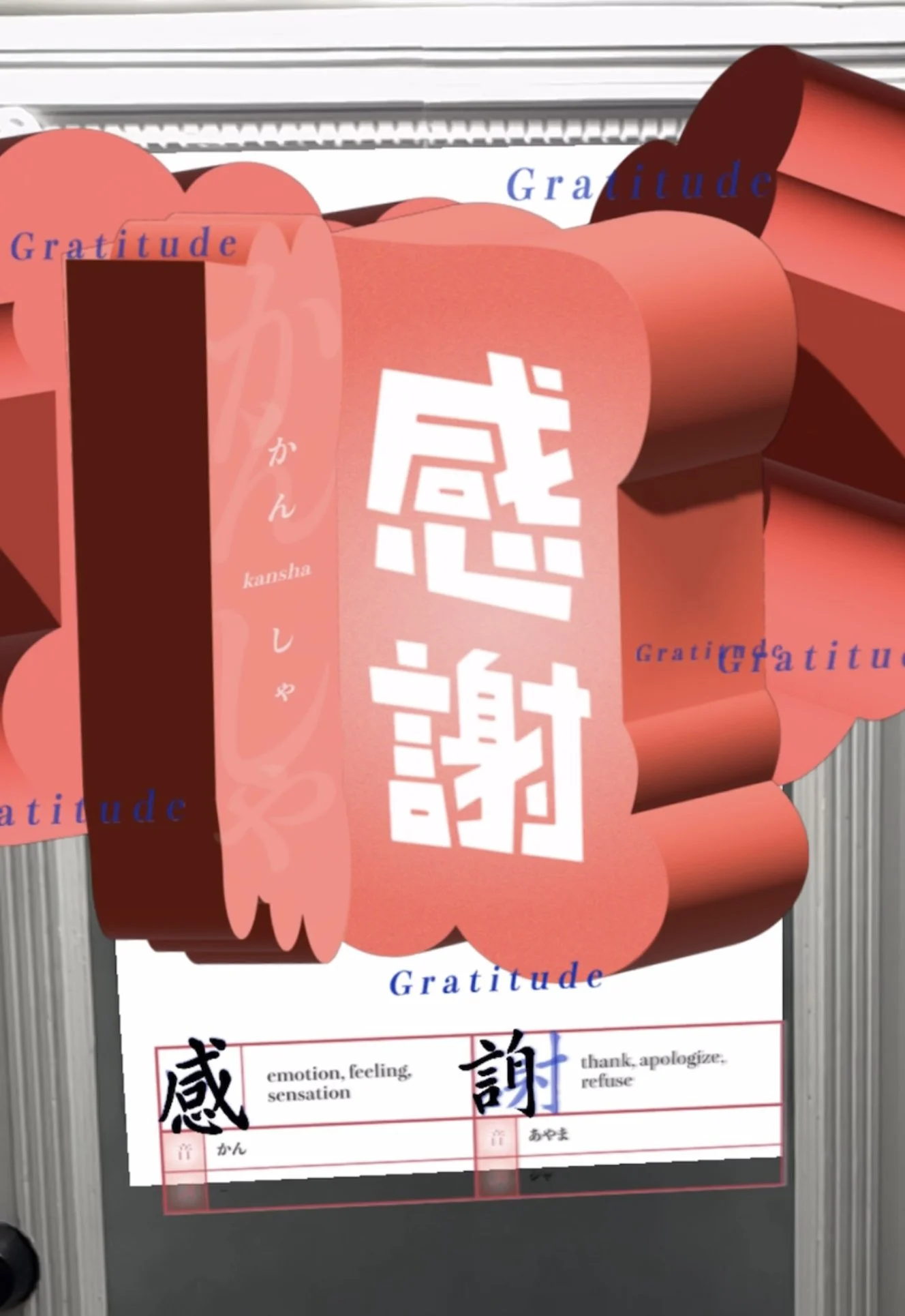
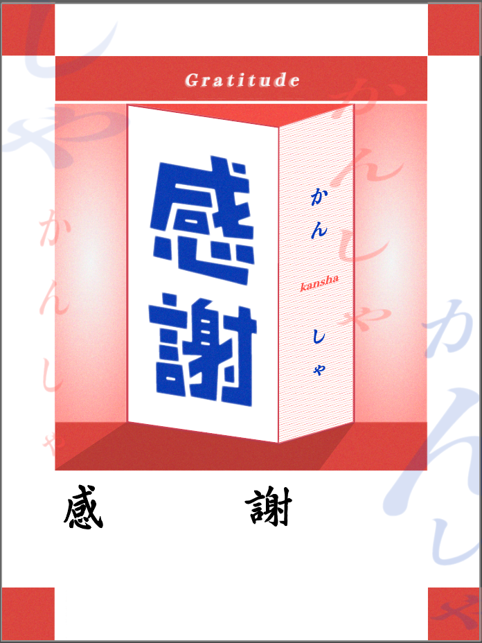
Still: Final AR component
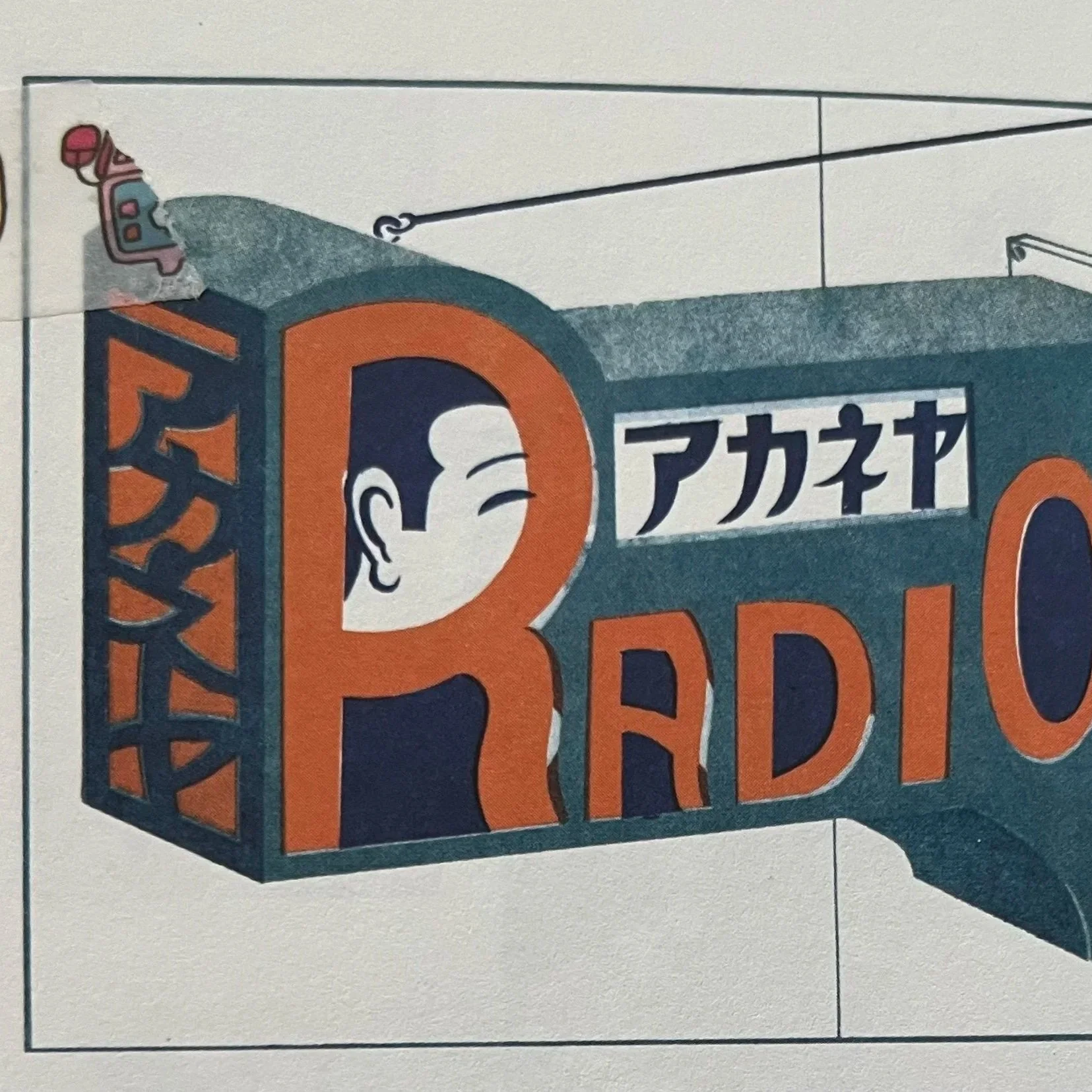
Research and Inspiration
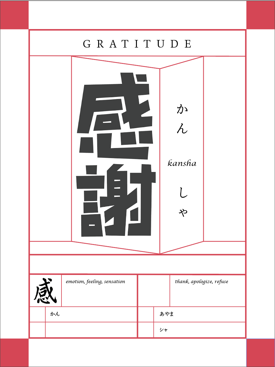
3D graphic elements
The use of 3D shapes and typography applied to various surfaces is inspired by a book of Japanese physical store signs from the 1920s-30s.
Structure
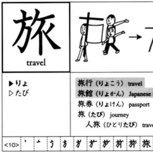
The table layout at the bottom of the poster is inspired by Japanese textbooks. This structure should be familiar to anyone who is already studying kanji.
AR educational tools
I explored existing AR educational tools to inform my own AR component, including content ideas, visual style, and applications of AR.
Visual style - color & texture
Various visual elements, including the color scheme, the risograph look, and the grainy texture, are inspired by vintage Japanese advertisements.
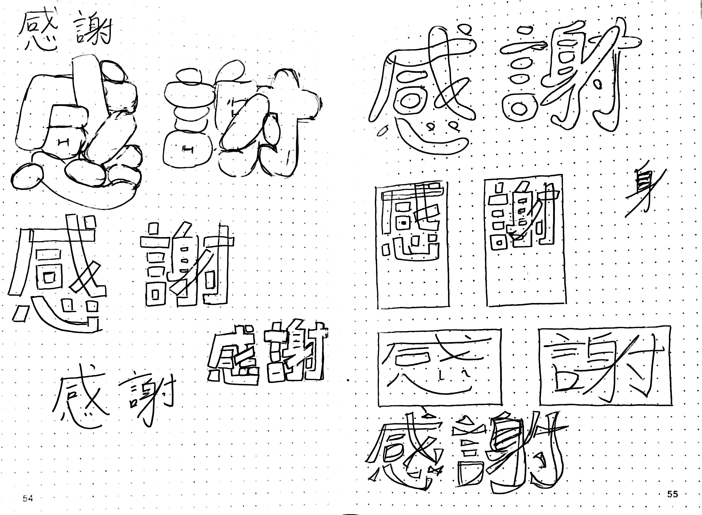
For the main typography, I explored handlettering as a way to create a bespoke look.
I experimented with several visual styles, and I chose the result that best conveyed the meaning of the word (‘gratitude’), as well as the goals of the project:
The wide letterforms with minimal spacing give a sense of closeness and warmth, expressing gratitude. The sharp corners of this version also prevent the typography from looking too childish, maintaining a sophisticated look for stylish home decor.
Handlettering explorations
Print component
This project was my first design school project ever, and in just several weeks my visual skills came a long way—owing in great part to guidance from Professor Félicia Barrett.
I started with a bare-bones visual look before learning to explore with color, texture, and form. The execution was undoubtedly shaky at first, but once I started using 3D shapes as my main visual element, the design started to unlock for me.
Eventually, I came to a cohesive, visually powerful design which reflects the meaning of the target vocabulary word: kansha in Japanese, meaning ‘gratitude.’

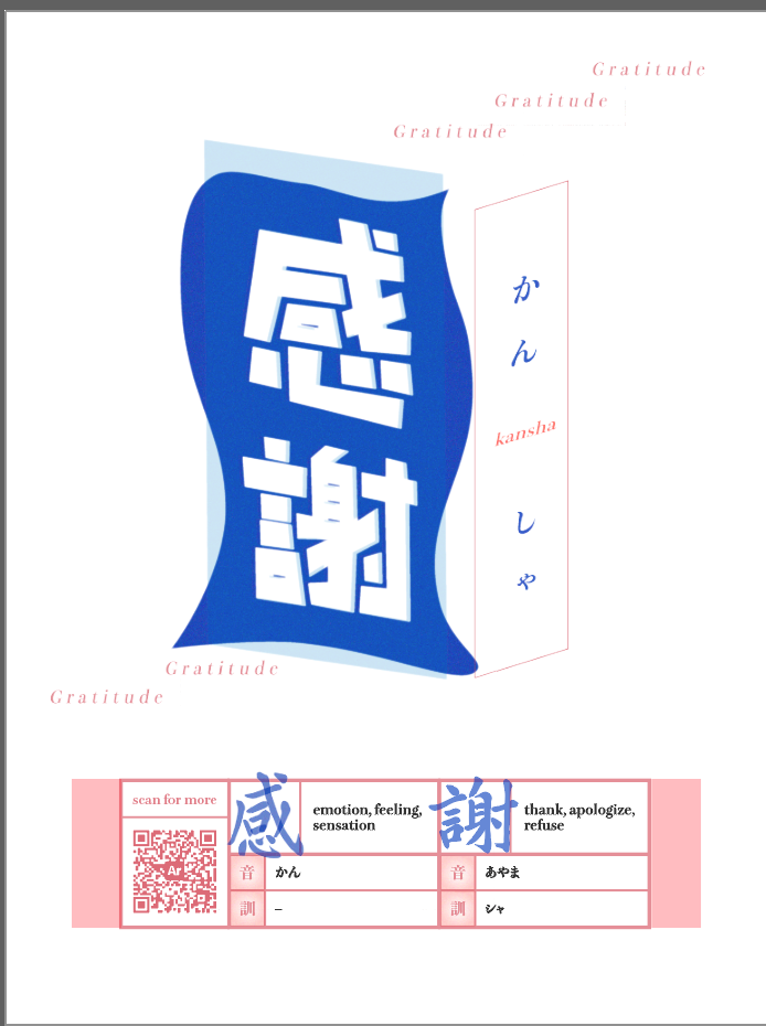
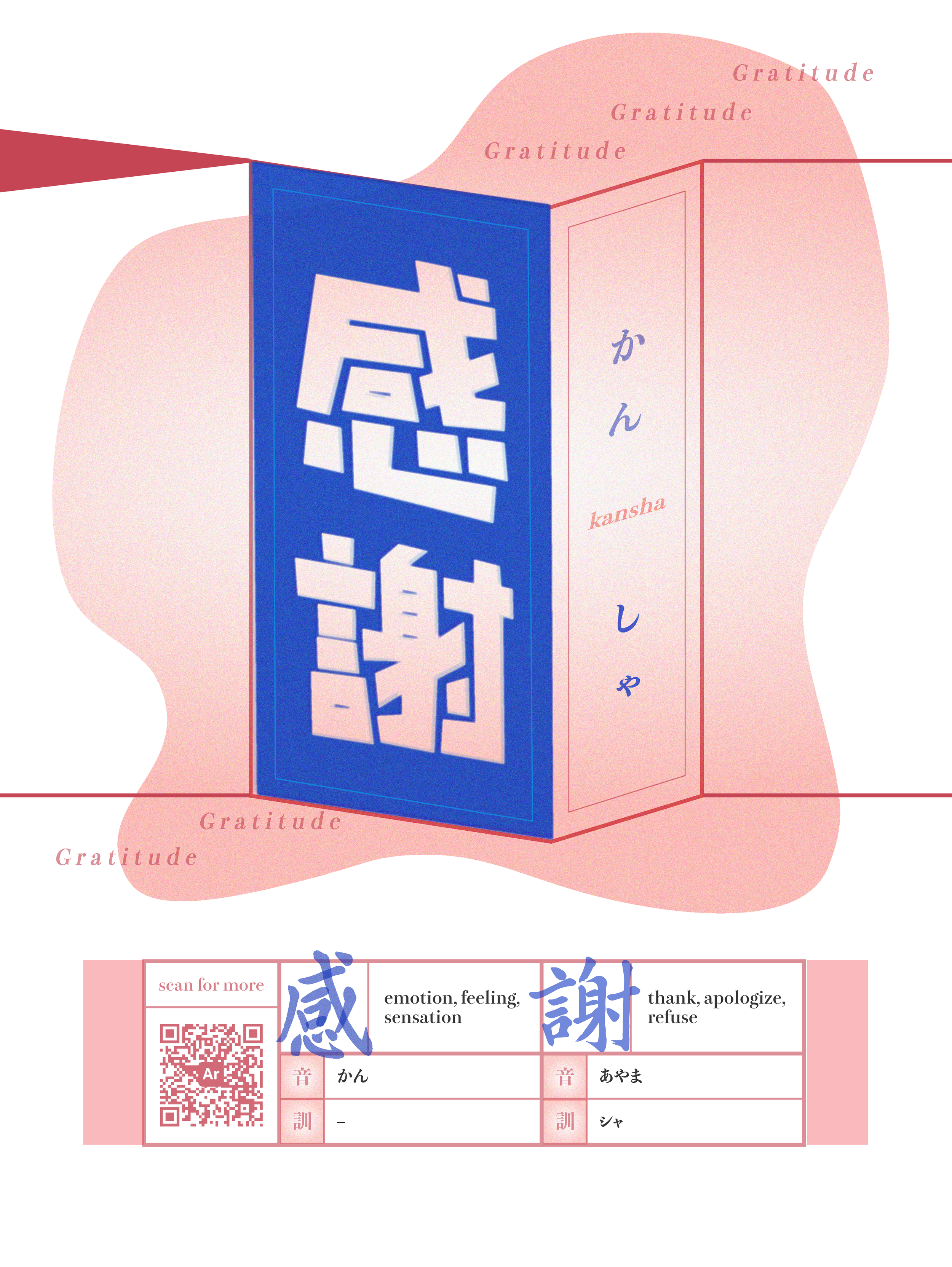
AR component
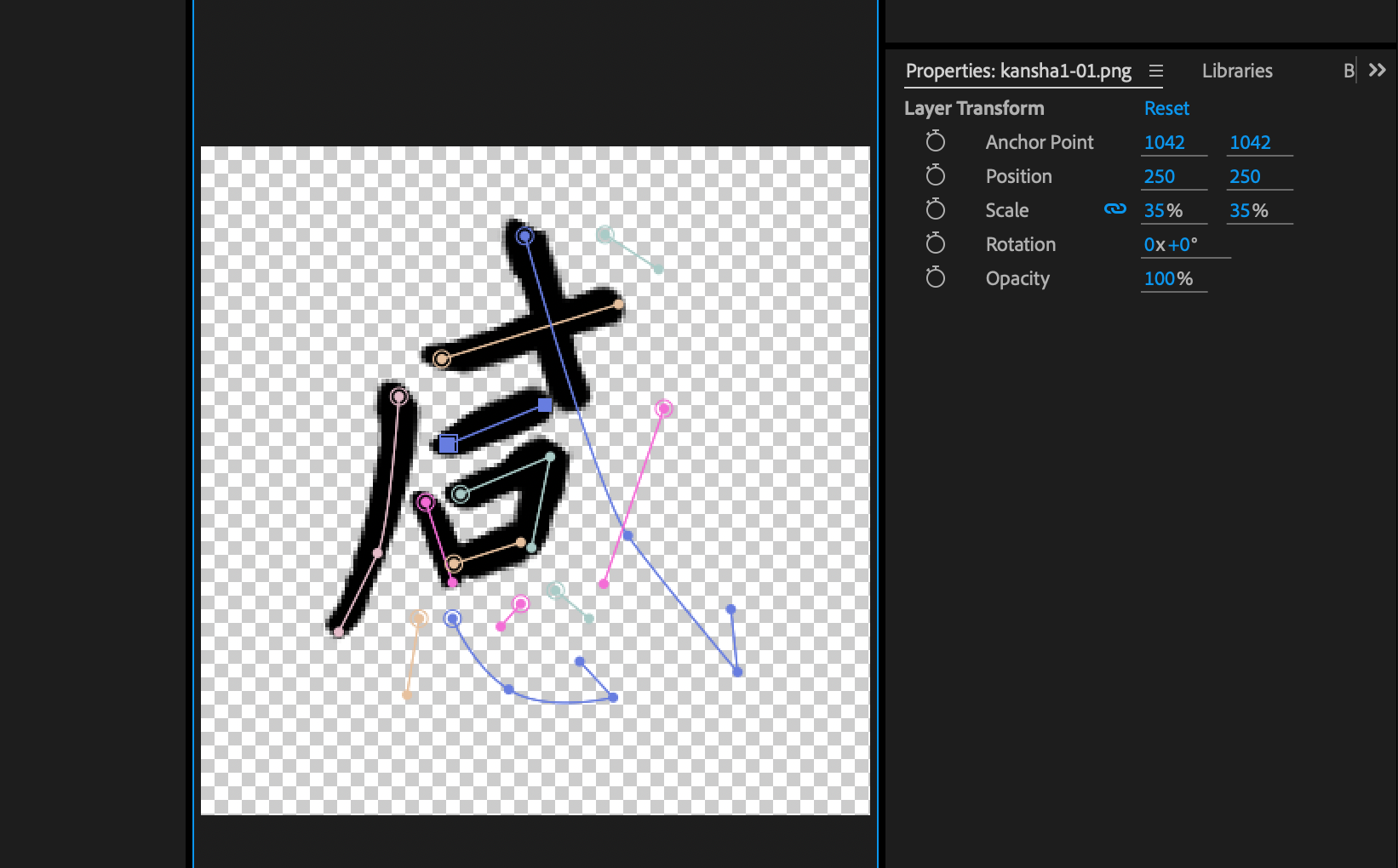
I used Adobe After Effects and Adobe Aero to create the AR component.
My main goal here was ensuring that the AR component offers enough payoff for the user to stay interested in using it. I wanted to avoid this feature becoming a one-and-done novelty.
To this end, I tested several versions of the print/AR combination and decided that the following would be exclusive to the AR version:
The “answer” to the target vocab word. The English translation of the word (in this case, ‘Gratitude’) can only be seen in the AR version.
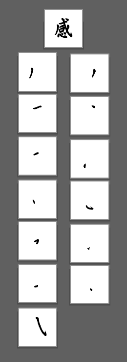
An animation that demonstrates stroke order. These complicated kanji characters are meant to be written in a certain order—this is a key component of learning Japanese and is more clearly expressed in animation than in a printed textbook!
An eye-catching 3D effect. This is a typical feature of AR—an image pops off the page and can be experienced in 3D. This is somewhat of a novelty; crucially, I believe this effect alone isn’t enough to bring the user back over and over.
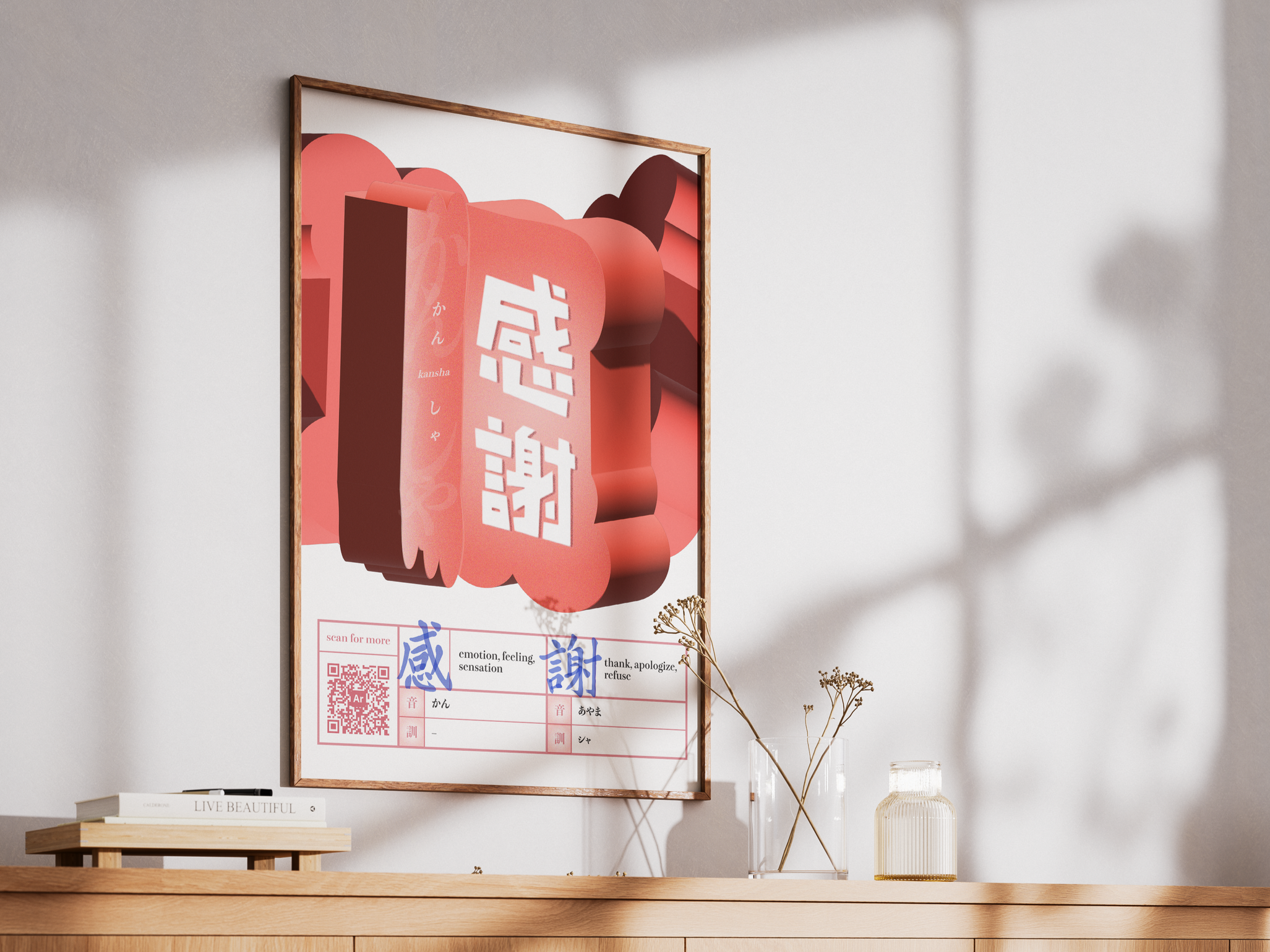
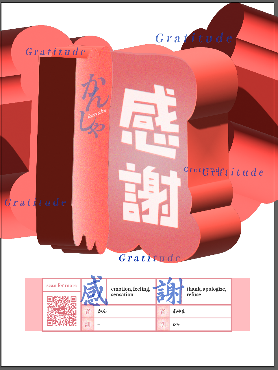
Final mockup
The final piece is eye-catching home decor that would inspire a Japanese language learner to hang it up in their homes, study often, and engage with the AR features.
This poster/AR experience is a “stickier” way to learn kanji and vocabulary than rote memorization, as there are strong visual and conceptual anchors attached to the target word.
Also, this poster is meant to fit right in with any stylish room!
Reflection
For me, this project was a lesson in designing for emerging mediums like AR, as well as an introduction to foundational skills for me as a new designer.
I continue to think of this project as a key first step in my design journey. As I develop my visual skills, my software skills, and a conceptual strength behind each of my designs, I often refer to the workflows and conceptual frameworks I learned in this project.